|
1. The art criticism process is: Describe the artwork: Describe what you see in the piece and the art elements in it. Analyze the artwork: List the design principals. Things like proportions, colors, values, texture, etc. Interpret the artwork: Name the mood, feelings, ideas, and the story in the piece. Judge the artwork: Is the piece successful or not and why? What evidence leads you to believe this? 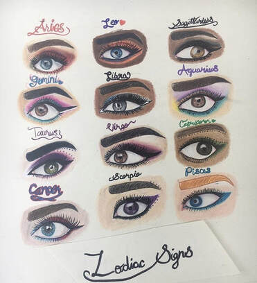 2. This piece, titled Zodiac Signs, shows different drawings of eyes that represent each of the zodiac signs. Each eye has a different skin tone and eye color as well as a different makeup style. The drawing was done in colored pencil and parts were outlined in marker or pen. Each eye is roughly the same size, given the ethnicity changes throughout every part. The first 3 eyes (Aries, Gemini and Taurus) all have a more realistic take to them. Cancer and Leo are less realistic and have inaccurate shapes in them. For example, the eyelashes on Cancer seem to be going straight up, where in reality they'd be going outward. In Leo, the eyebrow is unusually close to the eye and is also missing some of the realistic creases and values that actual eyes have. After Leo, the drawings turn more into a cartoon-ish style. With evident outlining around the eyebrow, unrealistic eyelashes, uneven skin tones, and unnatural shapes, these eyes look completely different from the first three. There is a feeling of equality throughout the piece because of the variety of skin tones and eye shapes. The idea of the piece is to represent what zodiac websites and blogs believe is the best way for the signs to be shown through the expression of makeup. I believe, for the time I drew this (2017), it was extremely successful. Now that I've improved and learned from my mistakes, I'd say it's partially successful. For the first three, I used references, which helped me, but for the rest you can tell I didn't do that. This drawing, I would say, was a stepping stone to get me where I am now. The point is shown well and the equality is successful. Parts of the drawings like proportions and natural shapes make it partly unsuccessful.  #4 What are some reasons why an artist makes art? There are many reasons artists make art. Sometimes it's for enjoyment or to pass the time. It could be to make money or to show off. Everyone has a different motivation for doing things. Everyone can be an artist, even if it's just drawing stick figures. I drew this drawing for my friend back in 2016. Besides it being a gift, I wanted to draw something for my favorite book series at the time and try to get better at drawing people. At that point I didn't know how to do much of anything except color, so I used a drawing from an artist known as Burdge, and looking back it didn't really help my skills but it made my friend happy. Seeing her reaction made me realize why I do art: to please people, mostly myself. Also to pass time and to have fun. 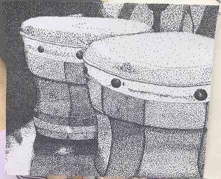 #10 Regardless of whether a project was successful or not, describe the one where you learned, grew, or developed the most from? I definitely learned the most from the drawing unit, specifically the ink part. I sort of fell in love with stippling. I doodle with it all the time. If not for art class, I wouldn't have known about this technique. I have worked on many small drawings and am planning to do a bigger one in this style using the skills I picked up from this unit. 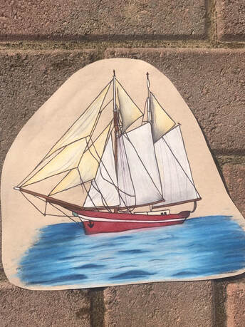 #11 Choose a place or artwork where the subject matter reflects you as an artist. One that you have a personal connection to.
In 8th grade, I drew this piece, titled Little Red Ship, for a Language Arts project. The project was to write a poem to represent yourself by comparing yourself to something. I chose a little red ship. This drawing was a first for me, too. I had never drawn water before this point, and it was mildly successful. It's definitely water, but it doesn't really capture the realism of the actual sea. I chose to represent myself with a little red ship because I had just gotten through a huge ordeal with my friend group in the previous school year and was in a toxic friendship at the time. The poem describes what I see in myself and how the dramas with my friends had affected me. This shows the skills I had gained up to the point when I drew this. I had grasped the concept of depth and value and could see colors separately from just plain red or blue. I noticed small details in my reference that I added in, like the shadows and small ropes, that really added to the grand effect of the drawing.
0 Comments
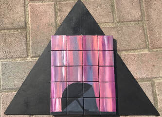
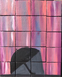
Pros: The small canvas's made the painting process really fast and easy. The size also helped lessen drying time. The black of the backing wood piece makes the colors really pop, especially the orange and purple.
Cons: For some reason, a few of the canvas's are taller than the others which makes parts of it uneven. It was also hard lining them up perfectly without the other ones moving. Because I had so many of them (20 to be exact) it was hard to take them places. Process: Originally I was going to paint melted ice cream instead of the umbrella thing I have now, but it didn't really work out. I started with a pink base and drew the ice cream cone and scoops. After I painted it, I didn't really like it, so I painted over everything with a new pink base. I then drew and umbrella and taped it off. I painted the background colors and finished by painting the umbrella. I hot glued it to a piece of wood than I painted black and sealed it with acrylic sealing spray. 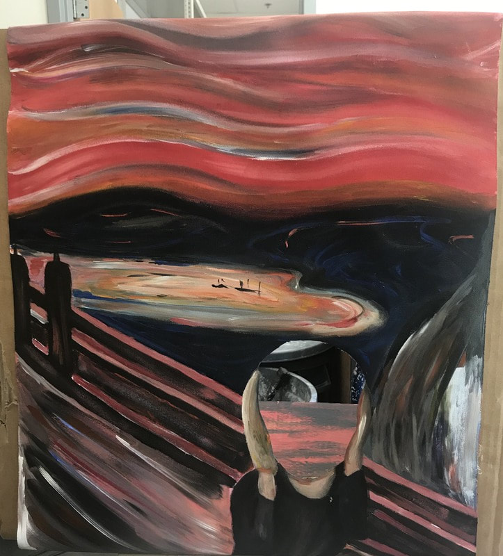 Pros: The pros of this piece were that it didn't have very many specific angular parts so it was easy to map out where things went, the colors continued throughout the whole piece so I didn't have to match a million colors, and the freedom of painting sort of randomly was nice.
Cons: The size was a bit hard to figure out. In order to make the persons face size stay proportional to the painting and make the head hole big enough I would've had to make the canvas size really big. I had to go smaller so it didn't take forever and it was noticeably a little small for a normal person face. Process: I basically painted it from top to bottom. I first roughly marked the parts of the painting with a pencil. Then I painted it in sections. I did the sky, then the sea, then the bridge, then the person.
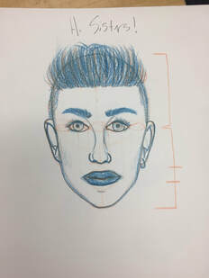
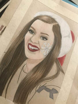
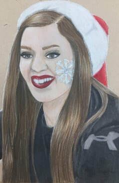
1. This is a portrait of my step-sister Ashlyn.
2. I used Prismacolor colored pencils. 3. First I made the outline of the drawing in regular pencil, then I worked in sections to color it. 4. I find the look of the hair and Santa hat to be successful, as well as the accuracy of the colors to my reference image. If i were to do it again I definitely would've colored more carefully on her features because it doesn't all look very accurate.
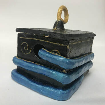
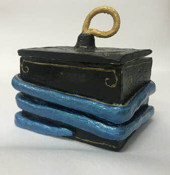
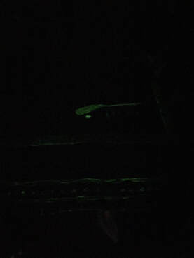
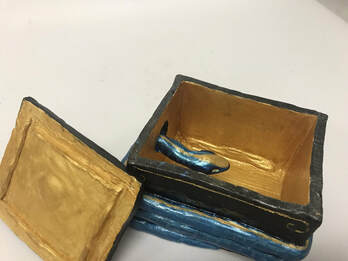
1. Since completing the last clay blog post my box was fired and I used acrylic paint it. I also used a finishing spray to seal everything on. 2. I think the mysterious effect was really successful. I like the surprise of the glow paint, too. The designs came out fairly good, and help with the effect as well. 3. The second time around I would've put more detail into the painting part and would've tried to make the clay smoother, especially on the snake. the snakes body came out a bit uneven and lumpy.
 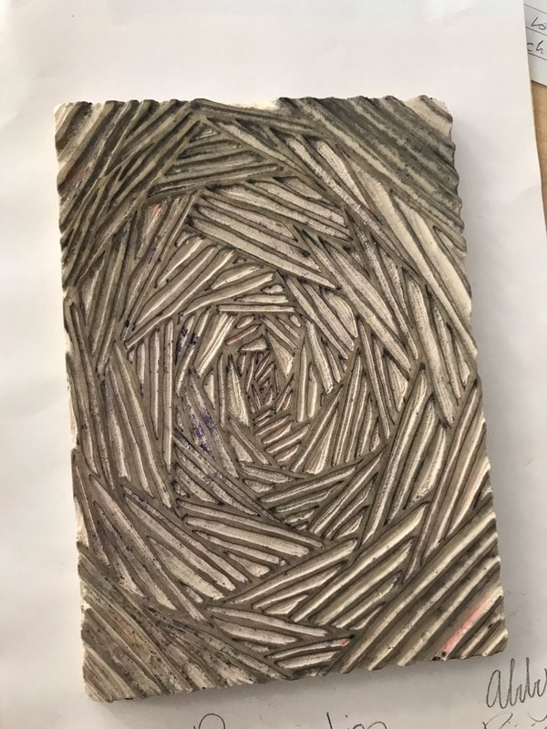 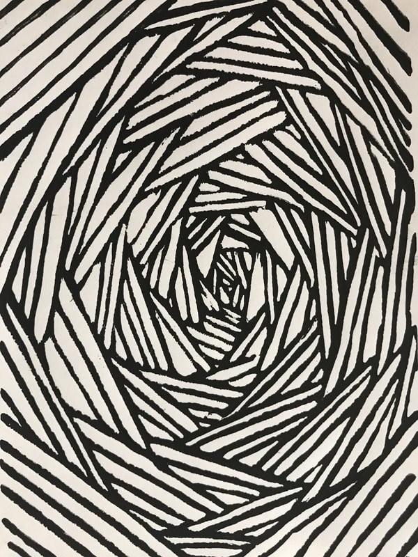 1. My piece shows of the theme of line by being completely comprised of lines.
2. I think it successful because of the effect that it's going in and how clean the lines are. If i were to do it again I would probably be more careful on some of the cuts and try to makes the line thickness more even throughout, especially in the middle. If i were to do another print I would use two different color inks and see how that works. 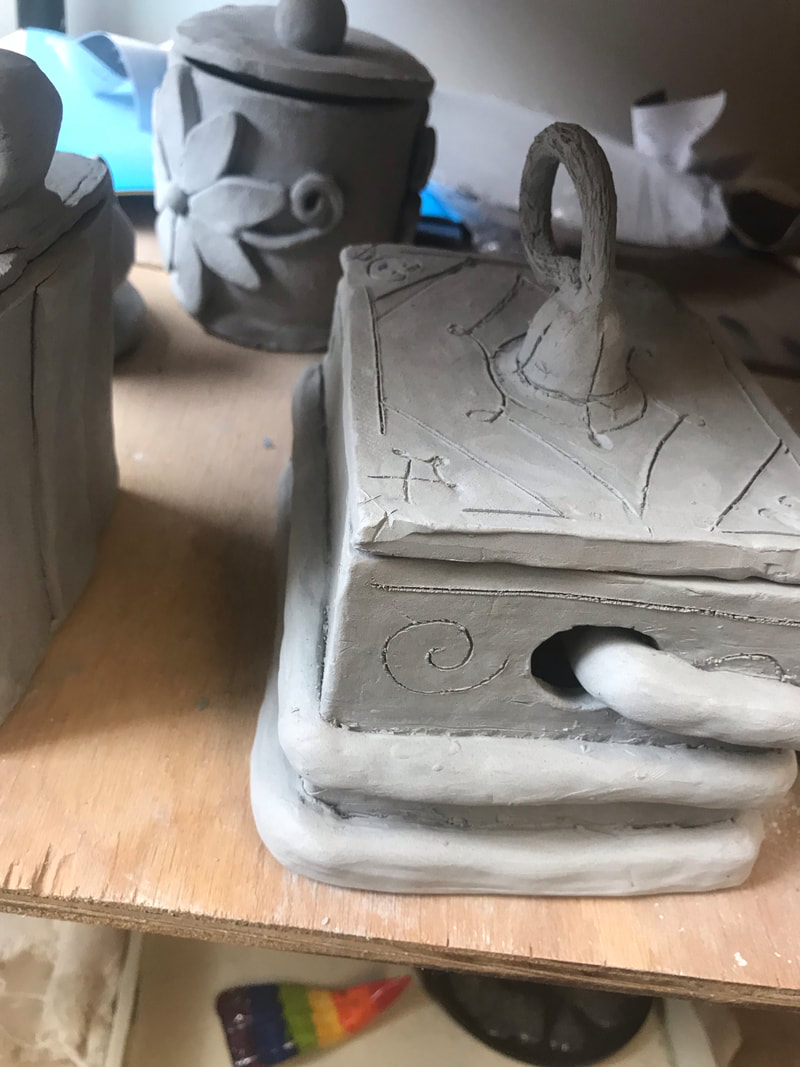 1. I plan to paint my piece with acrylic paint to give the box a mysterious effect. I want to make it look regal, ancient, and foreboding. I don't know what I'll use it for, but I hope the snake's head inside scares someone.
2. I found attaching pieces to where I felt they were secure, getting them smooth enough, and getting the designs clean enough were all very hard. Attaching the pieces was difficult because I was never sure if any of the clay was too flimsy or wet or if it was too dry. Also, I wasn't sure how much to scratch the clay. It was hard getting it smooth evenly around, especially on the snake. It didn't end up as smooth as I would've liked, but after the clay became leather hard it was difficult to smooth it even more. The leather hard consistency also made it hard to make the designs clean. 3. I think I was successful at making the box look mostly even, not misshapen. I also think the mysterious effect pulls through because of the strange designs on the top. The snake also adds to this, and I especially think the head looks good. 4. I started out by making 6 slabs for all the sides so the stages in the greenware part of the process were all even in drying time. I then scratched-and-slipped all of the sides except the lid and attached them. Right now the piece is firing or has just finished firing and is in the bisqueware stage. |